Origin of MUJI: from Colorful Art to "Colorless" Innovation
How the genius of color, Ikko Tanaka, pioneered a "colorless" brand that redefined consumerism with Japanese values
第7号
Welcome to the seventh edition of Ordermade (オーダーメイド).
Ordermade curates a weekly collection that captures the essence of こだわり or 'kodawari'—a deep dedication and care—in art, fashion, interiors, architecture, music, and literature with Japanese sensibilities.
Did someone forward this to you? Subscribe below.
For this week’s issue, I’m trying something different. Just one essay. Deep dive into the origin of one of the most known Japanese brands, MUJI.
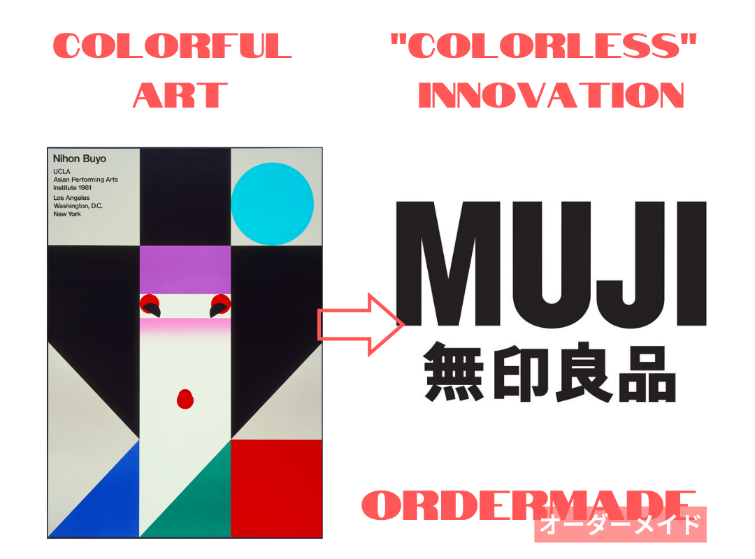
Famed for his vibrant art, Japanese graphic designer Ikko Tanaka was also the mastermind behind MUJI's “uncolored” branding.
Nihon Buyo UCLA poster (left) and MUJI logo (right)
He made that design choice to start MUJI as a radical antithesis to consumerism in 1980s Japan, embodying Japanese values.
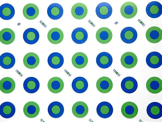
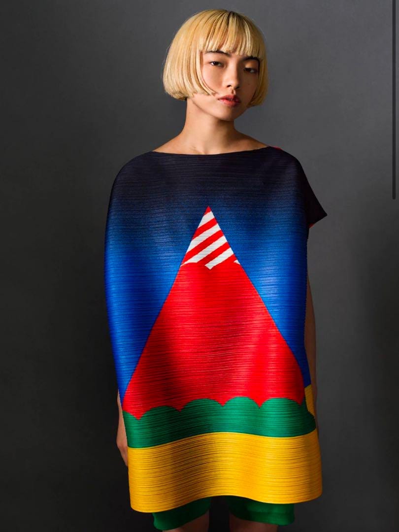
Known for his colorful and modern takes on traditional Japanese elements, Ikko Tanaka worked closely with big names like Seibu Department Stores, the birthplace of MUJI as a private brand, and also collaborated with brands such as Issey Miyake.
Seibu department store wrapping paper (source)
IKKO TANAKA ISSEY MIYAKE Pyramid PLEATS (link)
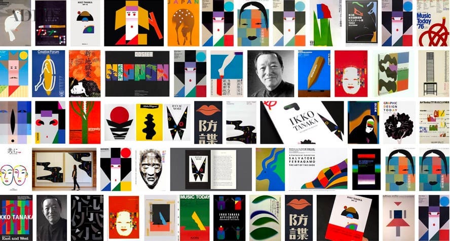
He stepped into the design scene in post-war Japan, a time when foreign influences and consumerism were taking over Japan.
Works of Ikko Tanaka (source)
Following the defeat in World War II, the Japanese were starting to romanticize the extravagance of American culture showcased in movies and fashion. The consequences of the war also meant people were hungry for material possessions for decades after the end of the conflict, leading to an acceleration of consumerism.
Only the things that could be consumed had value.
But approaching the 80s, it became increasingly difficult to sell goods due to the market being inundated with goods and events such as the 1973 oil crisis.
As a result, companies resorted to one of two strategies: 1) producing low-quality goods at a cheaper price, or 2) launching aggressive marketing campaigns with trendy designs to appeal to consumers.
Enter the era of "branding," a time when the allure of a brand name overshadowed the intrinsic quality of products. The quality of the product was no longer THE factor in making a purchasing decision; instead, consumers relied on the power of brands to guide their choices.
But amidst the noise, MUJI's approach was different.
Muji's design philosophy can paradoxically be characterized as a "design that denies design."
In an era when the term "design" primarily referred to the aesthetic allure that drove sales, Ikko Tanaka and a group of like-minded creators founded Muji, intent on rediscovering the fundamental role and essence of design.
Tanaka articulated the philosophy that fueled their venture succinctly: "Muji was established to pursue the best lifestyle."
To materialize this vision, the team focused on developing products that prioritized the consumers’ needs over the sellers’ by focusing on "rationalization of the manufacturing process."
MUJI was founded in 1980. Its origin was a thorough rationalization of the manufacturing process with an eye to creating simple, low-cost, good quality products.
Specifically, we reexamined products through three lenses: material selection, inspection process, and simplification of packaging.
For instance, if you omit the bleaching process for pulp, the resulting paper is light beige in color.
MUJI used this paper for its packaging and labels.
The ensuing products are remarkably pure and fresh.
In notable contrast to the prevailing over-embellished products in the marketplace,
MUJI's products both won great appreciation and sent shock waves not only through Japan but across the entire world.
from MUJI website
Thus, the name MUJI was conceived.
https://en.m.wikipedia.org/wiki/File:MUJI_logo.svg
MUJI is short for Mujirushi-Ryohin, which translates to "no-brand quality goods." in Japanese.
Tanaka and his co-creators explicitly agreed not to use English words in order to properly create something Japanese.
They maintained that no-brand quality goods didn't require flashy design.
That was why what emerged from Tanaka, a designer celebrated as a "genius of color," was an enchantment with the beauty of achromatism and the natural color of materials.
Upon gazing at a collection of MUJI products assembled in one place, he said to have "discovered a new continent of a completely uncolored world, the color of materials, a world of achromatism."
Much like his modernization of Rinpa painting elements within his graphic design, Tanaka adeptly "modernized" traditional Japanese elements and values such as simplicity and emptiness in the creation of MUJI’s product line.
MUJI's products, born from an extremely rational manufacturing process, are succinct, but they are not in the minimalist style.
That is, they are like empty vessels. Simplicity and emptiness yield the ultimate universality, embracing the feelings and thoughts of all people.
We have been credited with being "resource-saving", "low-priced", "simple", "anonymous" and "nature-oriented."
Without placing a disproportionate emphasis on any one of these varied assessments, MUJI aims to live up to all.
from MUJI website
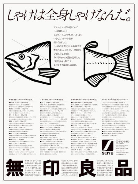
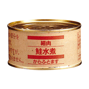
This philosophy is vividly mirrored in their inaugural lineup, as seen in the poster for their canned salmon where the poster said, "The whole salmon is salmon."
“The whole salmon is salmon” poster (source)
This succinct yet impactful message was crafted by Kazuko Koike, a copywriter who collaborated with Tanaka at MUJI.
Their canned salmon was both affordable and high-quality because they utilized the entirety of the salmon, whereas other companies just used the uniform torso portion to enhance the visual appeal, thereby wasting the rest.
MUJI’s canned salmon (source)
The simple packaging and promotional materials, devoid of vibrant colors, were designed to convey essential information effectively and efficiently. This approach subtly highlights MUJI's commitment to quality and sustainability, embodying its ethos without overtly flaunting its sustainable practices.
In a time of excess, Ikko Tanaka and MUJI chose the path less traveled, embodying Japanese values. Through their discerning approach to design, they reshaped consumer perception, proving that quality and authenticity can thrive in a market driven by branding and extravagance.
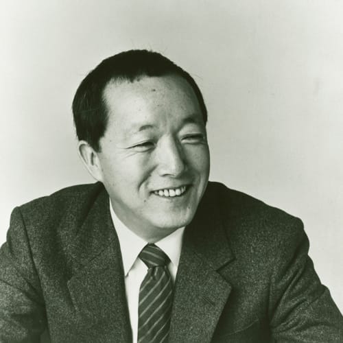
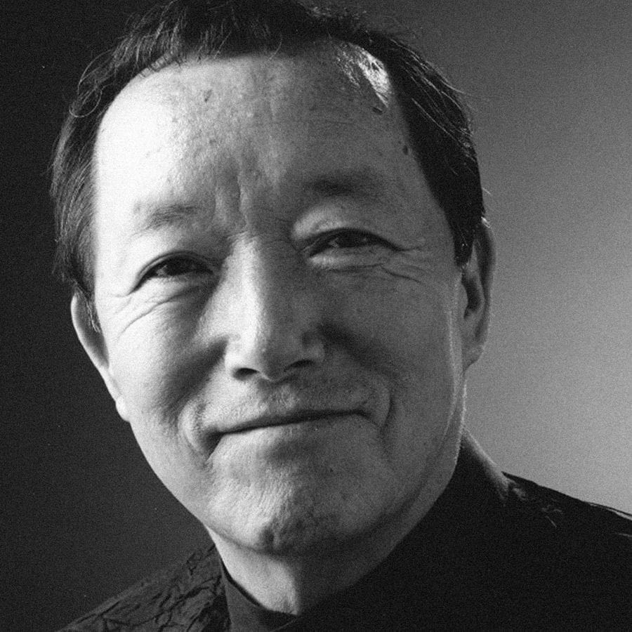
Ikko Tanaka (1930 - 2002) (source)
Ikko Tanaka’s legacy transcends his role as MUJI’s inaugural art director; he produced many other remarkable works until his passing in 2002.
While this post spotlighted Tanaka, it wasn't just him who made it all possible. I am excited to explore more about the other creators who played instrumental roles in birthing MUJI.
Sources:
What is MUJI?: https://www.ryohin-keikaku.jp/eng/about-muji/whatismuji/
Japanese Design Archive Survey - Ikko Tanaka: https://npo-plat.org/tanaka-ikko-en.html
無印良品のデザインは、質と美しさを持った普通を探り当てる作業: https://www.ryohin-keikaku.jp/csr/interview/003.html
「MUJIはこうして生まれた」創作チームからの証言: https://business.nikkei.com/atcl/report/16/111500181/041200004/
田中一光と無印良品: https://www.muji.net/ikkotanaka/index.html#/poster3


